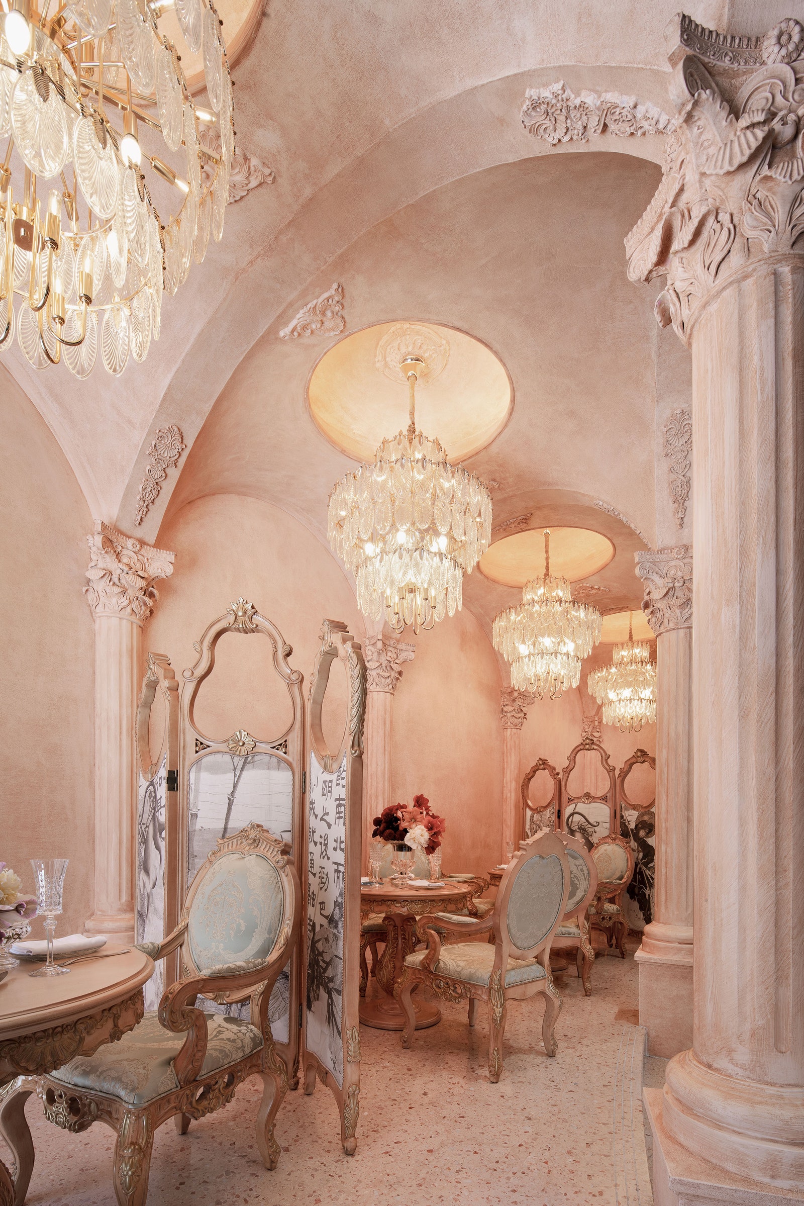
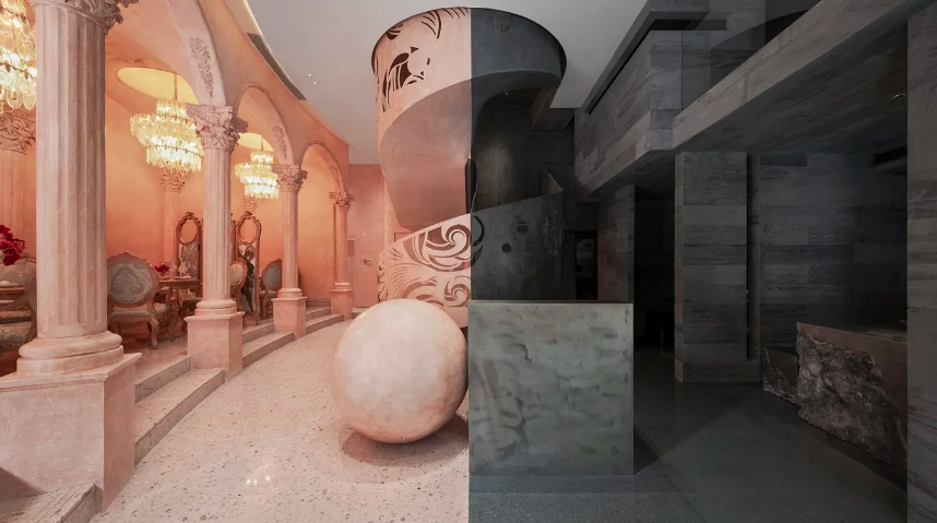
Conceptualised by One Fine Day Studio & Partners, ‘La Moitié’ is a retail store and eatery located in the suburb of Panyu District, Guangzhou in China. The name translates to ‘half’ in French, and the design aptly reflects that—inside the restaurant and store are opposing elements—square and circle, light and dark, pink and black, feminine and masculine. The space includes a composite commercial space—the first floor and mezzanine level are home to an upscale French eatery, while the second floor is a luxury designer clothing store.
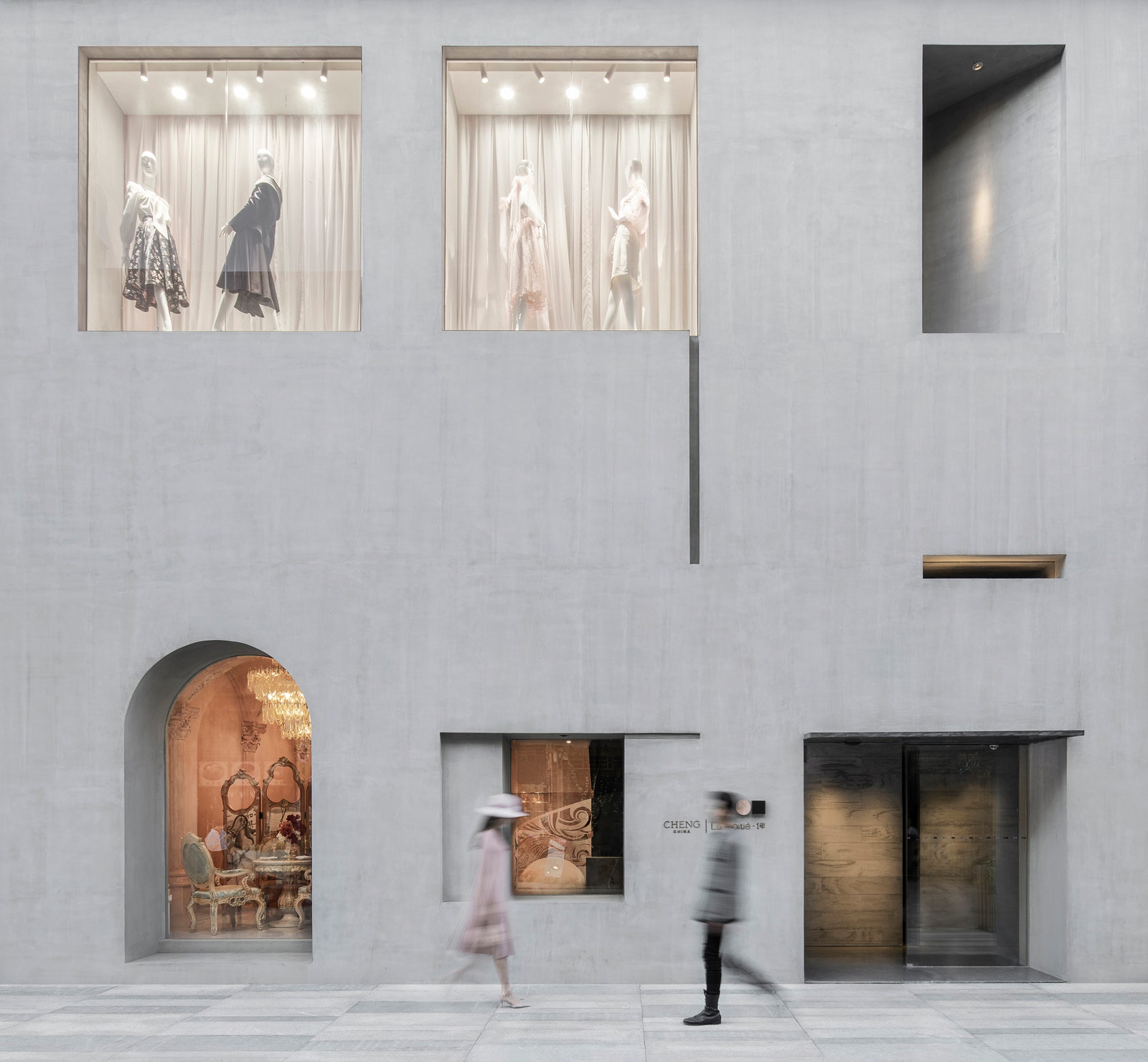
Split Personality
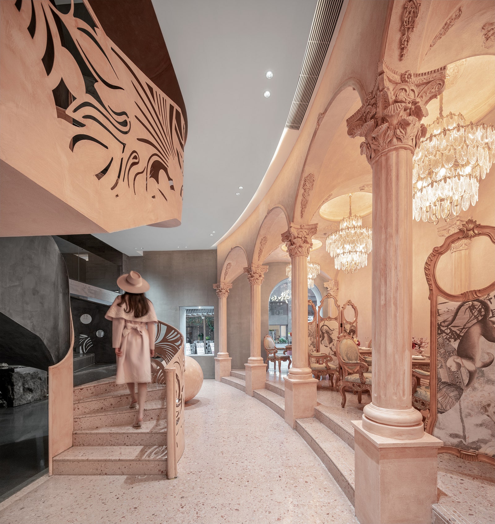
The design team led by design director Jump Lee created two opposing colours—soft pink and stark black. As a result, half of the space comprises a pink colour palette to create a classic, soft, ‘feminine’ aesthetic. The other side is a greyish-black box that presents a colder and more austere visual. The boundary between the spaces is clear, yet blurred at different perspectives. A spiral staircase, half pink and half black, is located at the centre of the space and offers a sculptural touch to the interiors.
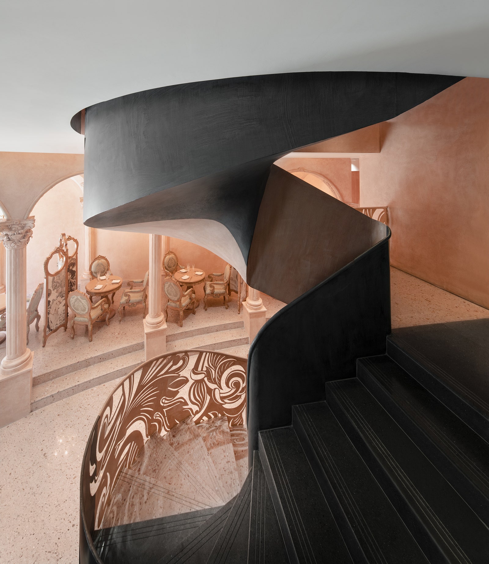
Contrasting Eateries
The softer side of the restaurant features bright lighting, classic details, opulent furnishings, majestic chandeliers and an abundance of accessories. The space is rooted in traditional Chinese design sensibilities. Here Victorian-style furniture upholstered in soft, subtle colours makes home. Old-fashioned Chinese divider screens separate each table offering privacy and intimacy. On the opposite, dark side, a rugged, minimal and almost futuristic vibe with dim illuminators, black marble benches, chairs and tables with clean geometric shapes and unfinished edges, as well as experimental sculptures take centre stage.
Opposing Boutiques
The designer boutique on the second floor is also divided into two sections. The pink area has a classic, Chinese aesthetic with a traditional divider screen placed behind the neutral clothes. The rest of the area features a circular marble table and a purplish-pink sofa. In contrast, the masculine section has a greyish-black, minimal setting featuring dark-toned clothes hanging on a black rod and a dark-hued rectangular table with a contemporary showpiece.

A spokesperson of One Fine Day Studio & Partners says, “The space was like an empty box, and we had to fit squares and circles inside harmoniously. We tried to fix these two storylines into one, and then tear them apart by using classical romance and modern avant-garde elements.”
