The Amsterdam-based design and architecture studio i29 Architects is well-known for conceptualising projects that are simple yet distinctive. Their portfolio includes a wide range of interior design and architecture projects for residents, hotels, restaurants and public buildings. Recently, this award-winning design studio designed an eco-friendly floating home on a canal in the Dutch capital city that exhibited unique architecture and one-of-a-kind interiors. Furthermore, tUnited States-based SAW executed an architectural renovation and landscape design of a 1930s home. A couple with three children reached out to SAW to expand a three-bedroom Spanish Revival home and to remediate and reclaim the soil below the home. The private residence was expanded by SAW both vertically and horizontally to include six bedrooms and 4,738 square feet of interior space. Known as the Wraparound House, the home is located in the Marina neighbourhood of San Francisco, United States. It came to the attention of the homeowners that the neighbourhood’s land comprises contaminated soil, from residue released by the former PG&E North Beach Manufactured Gas Plant, which was operational from 1891 until it was damaged in the 1906 earthquake. Thus, the land had to be remediated. Along with excavating the top four to six feet of soil necessary for remediation, the architects were also tasked with handling the instability of the landfill.
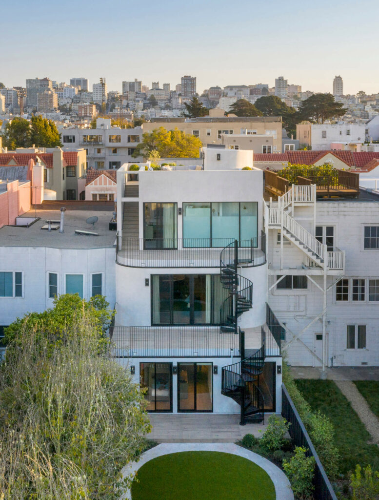
The home was expanded by SAW both vertically and horizontally to include six bedrooms and 4,738 square feet of interior space
SAW is a transdisciplinary design studio, working at the amalgamation of architecture, landscape, and urban design. While excavating the top layer of soil, the designers lifted the entire house, and modernised the entire foundation with a thick mat slab. This gave them an opportunity to redistribute load bearing walls throughout the ground floor, opening up possibilities for unusual spatial configurations and outdoor areas. “The Wraparound House lifts the ground plane from an extended back yard, up through a series of terraces, connecting across four levels of shifting vantage points, and allowing for a continuous experience of the landscape from the remediated soil of the yard all the way up to the roof deck with panoramic views of the city and bay. Rather than simply building upon the new ground, we saw the challenge as redistributing the ground vertically across the site, throughout the building. While many buildings have terraces, or balconies, or things like that, we set out to maintain a complete continuity of a new ground across the entire house, ensuring that every roof was not so much the top of something, but the bottom of something – a new ground,” says Dan Spiegel, architect and founding partner of SAW.
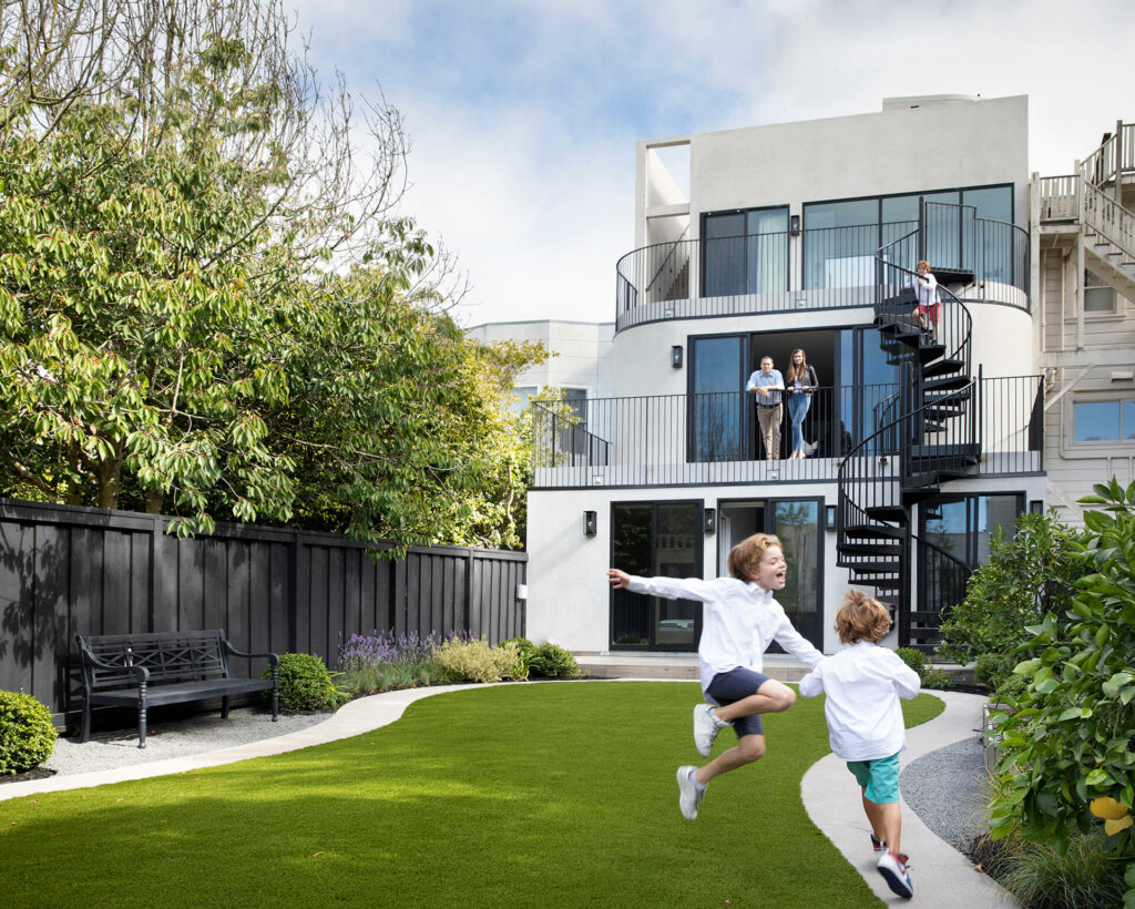
The Wraparound House lifts the ground plane from an extended back yard, up through a series of terraces, connecting across four levels
An arresting interior staircase design forms the heart of the home and an exterior stair also connects the floors via the outdoor terraces. Each floor of the home has a different relationship to the outdoors. While designing the terrace of the home, the focus was on the spectacular views of the Bay and the Golden Gate Bridge. The children’s bedrooms were given direct access to the backyard, which functioned as a verdant backdrop for the living room. Finally, the primary bedroom was encompassed with large windows to let in abundant natural light.
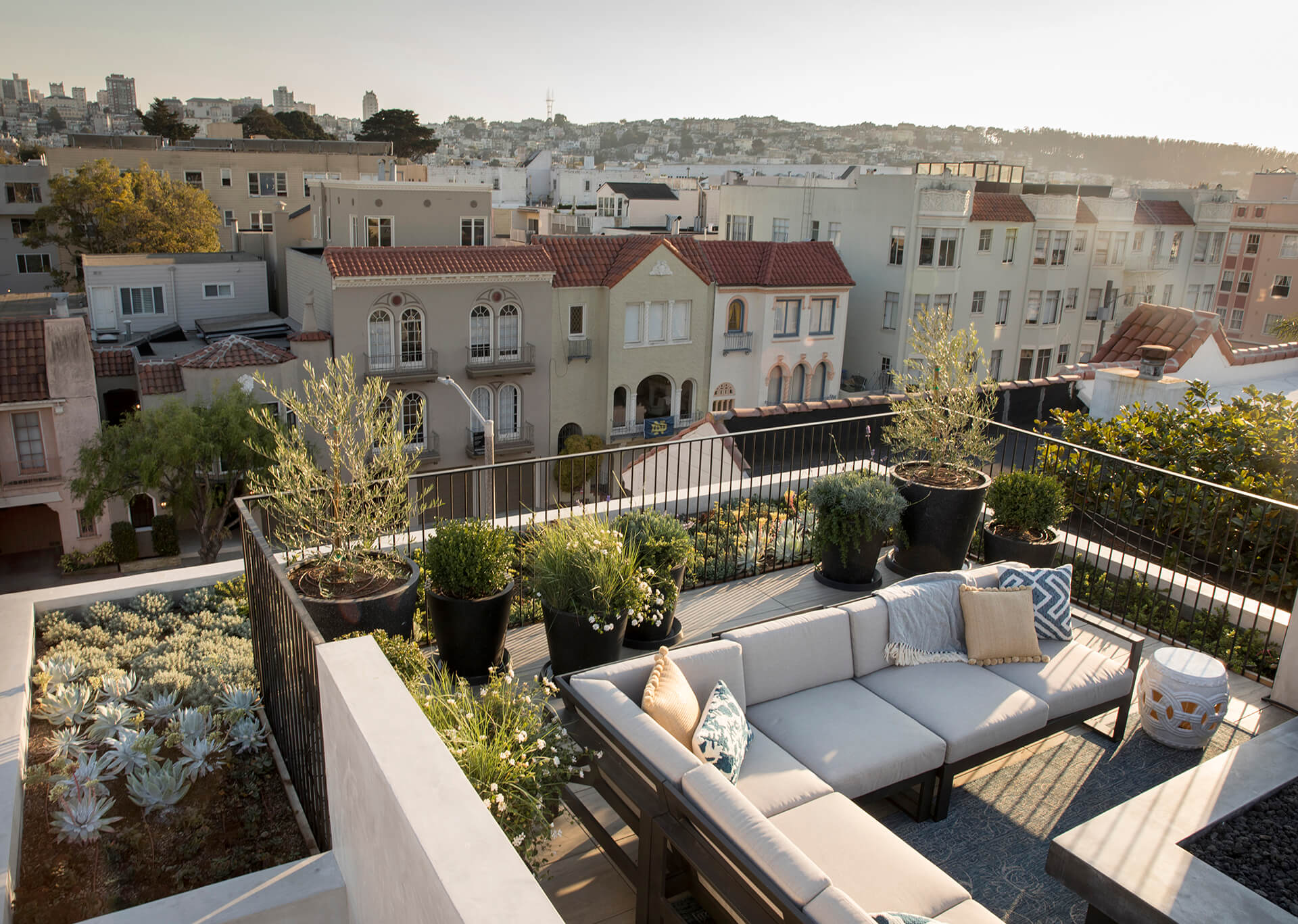
“It sort of works as a gradient: the spaces are more public, more outward looking at the top, and more private, more inward looking at the bottom. The rounded edges of the garden path play in the perpetual motion game too, forming a scooter/bike track; the rounded corners of the family room gradually guide you out to the terrace; the master bathroom is conceived of as a thickened window for the bedroom, balcony-like and perched over the bay. On most days, I am just as likely to take the exterior stairs as the interior stairs to move between rooms. It doesn’t quite look like it, but it works a bit like a mobius strip in that way,” mentions Spiegel.
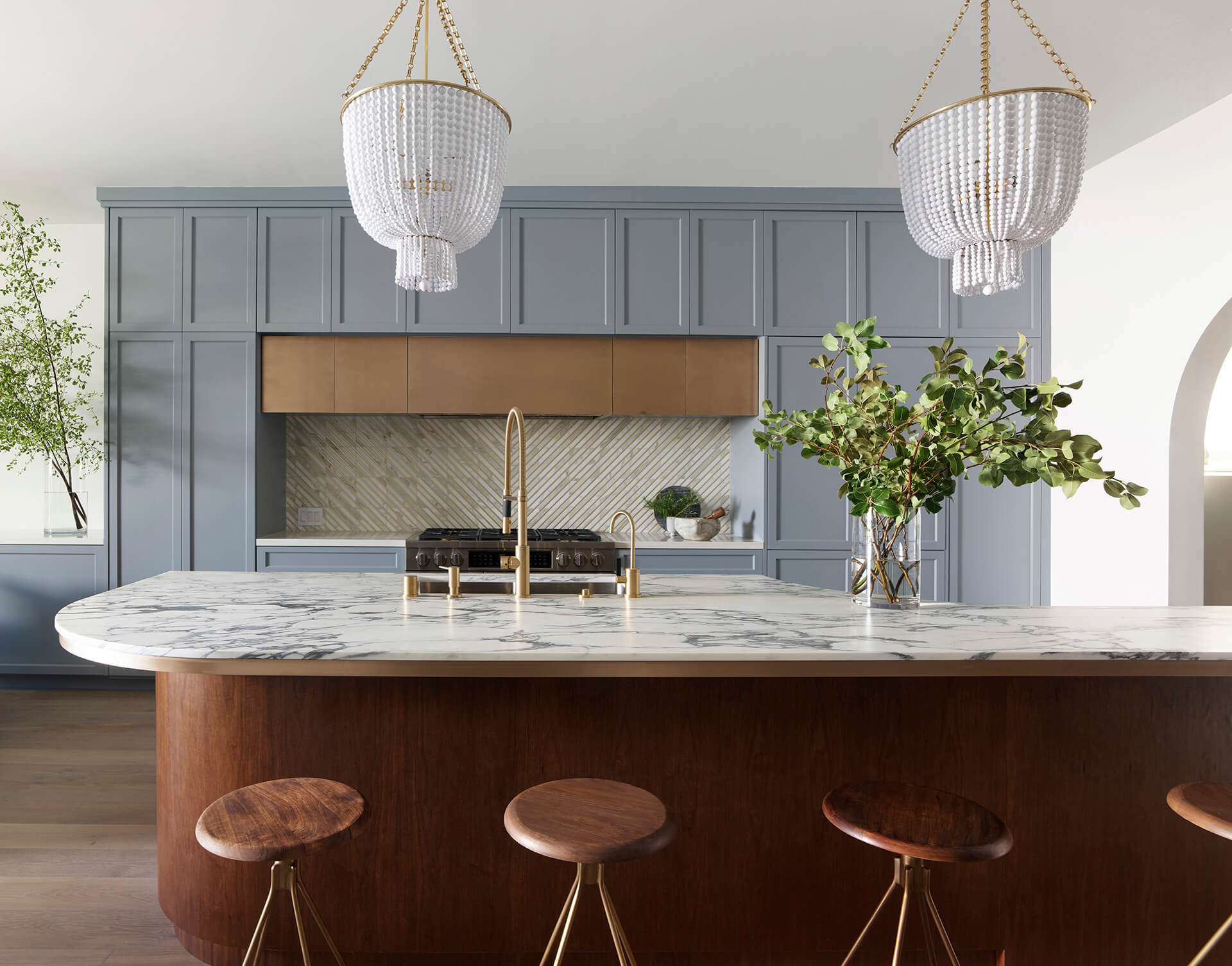
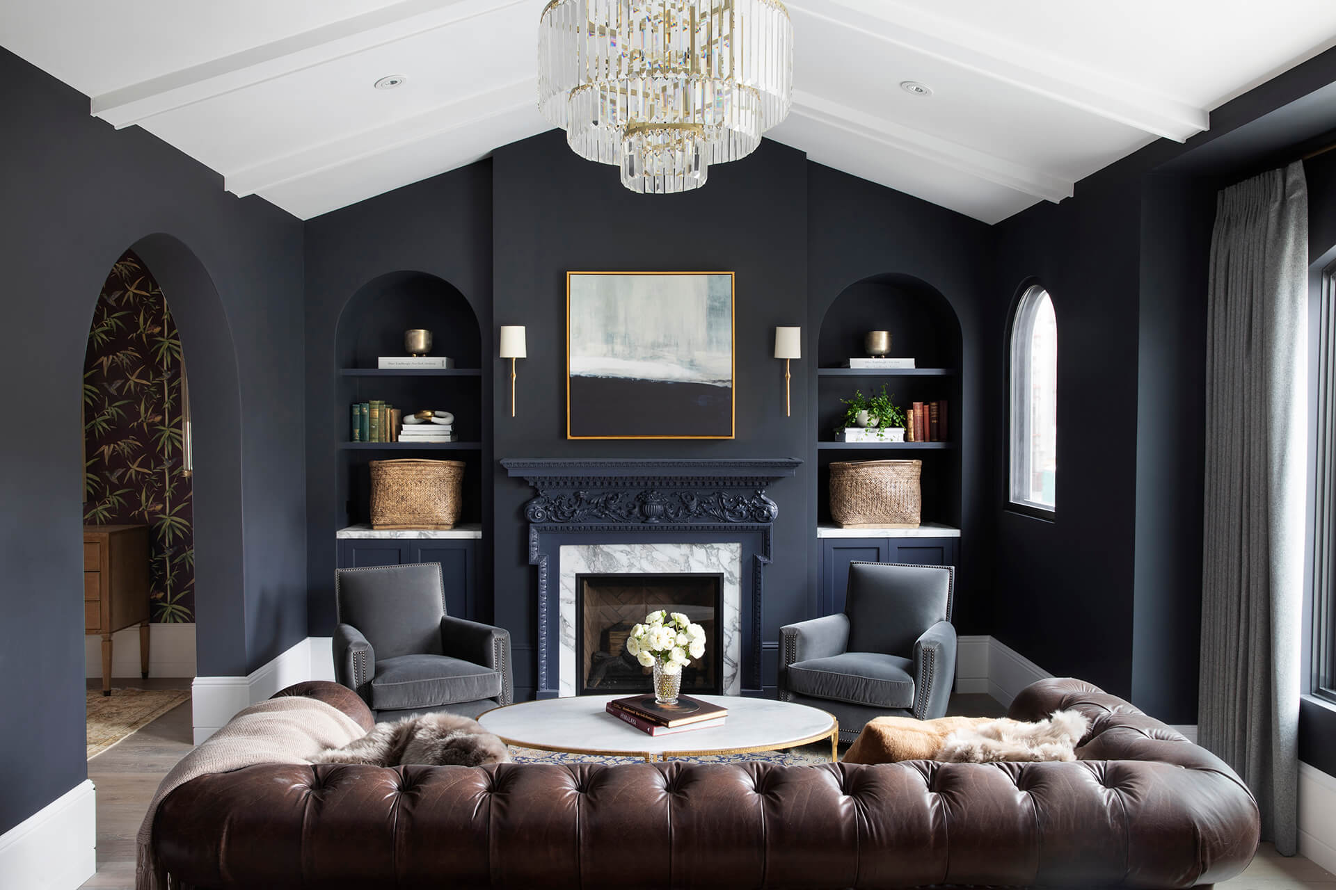
This curved form of the building is reminiscent of the arched doorways in the existing 1930s Spanish Revival-style home. For the interior design, by designer Heidi Kim of White Space Design, the Spanish Revival style of the original home inspired the use of geometric forms. The rounded arches bend light softly, blurring the divisions between spaces, and defining movement through the home. “In fact, the name ‘Wraparound’ is derived from the impact of subtle variation in corner geometry on directional movement, in the same way a rounded corner on a hockey rink serves to help wrap around the back of the goal and control a puck to the other side. We asked ourselves: what are the limits of such a legible, recognisable form? When we cut the arch in the living room in half and began pulling the corners apart, the Spanish Revival arch became the Streamline Moderne wall. This was exciting to us, as we had been contemplating the context and how to make a house from 1931 and an addition from 2020 (the future!) connect without solely relying on ornamental references. But it turns out, by experimenting with the 1931 arch forms, we re-discovered that 1930’s Marina architecture already had a vision for the future, which was the subsequent Streamline Moderne style. We wanted to embrace this link, and, of course, we found these forms to be beautiful,” adds Spiegel.
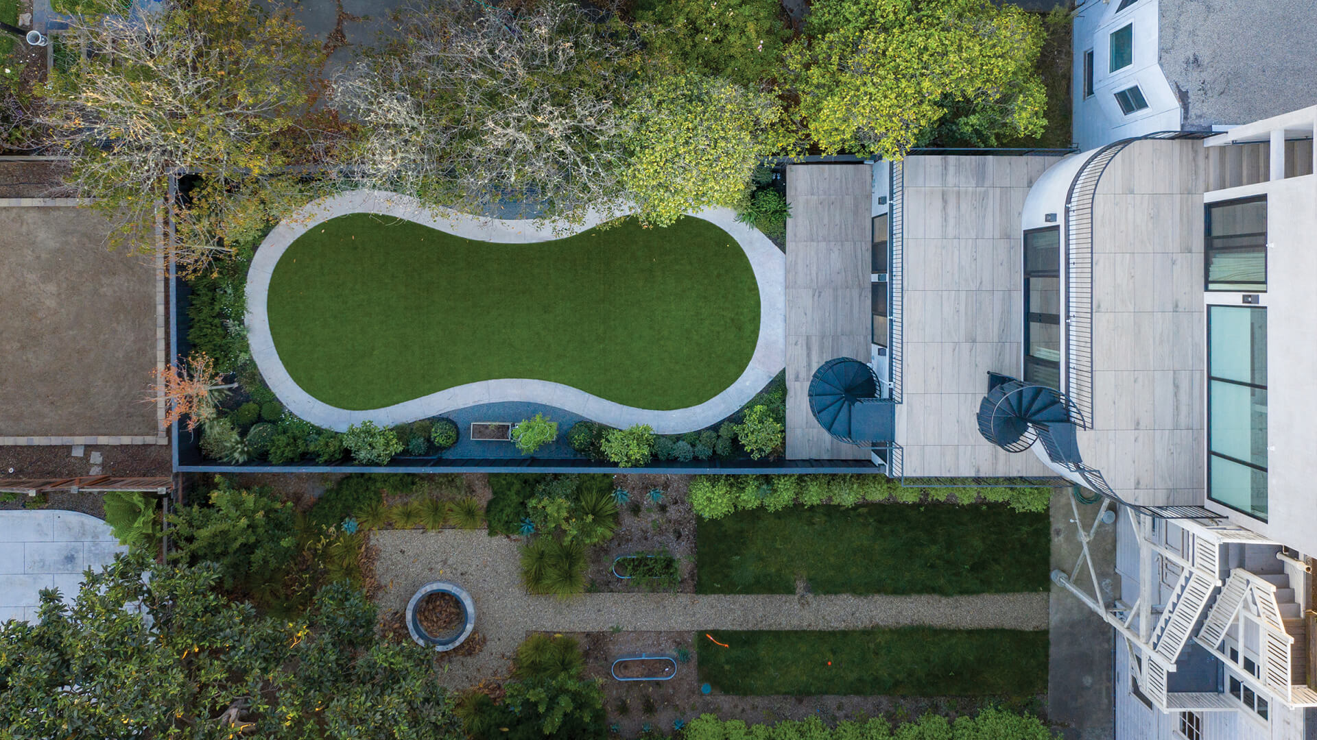
Furthermore, when it came to landscape design, SAW had to start from scratch as the top layer of the soil had to be removed. While designing the backyard, the architects kept in mind the fact that it would be experienced from multiple floors and planned it accordingly. New soil was brought in, artificial turf was used for the lawn and mature trees were planted.
