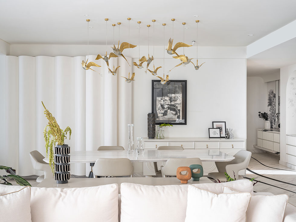
A couple commissioned Akash and Poonam Mehta, founders of AMPM Designs, to design the interiors of their 3,225-square-foot home in Pune. The clients had a large art collection for their home, and as a result, the entire design of the home was centred around these art pieces. To elevate the colours in the artworks, the interior designers chose a white colour palette as a base. AMPM Designs paid careful attention to this colour scheme and balanced it with vibrant decor pieces throughout the rest of the house. The result is a spectacular display of art and design, where every room of the apartment works cohesively to craft an aesthetically pleasing space.
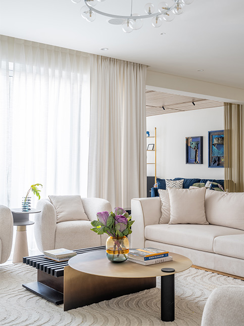
Known as the ‘House of Art,’ this Pune apartment comprises a living room connected to a study/family lounge, a mandir, a dining room, a kitchen, a store room, a primary bedroom, bedrooms for the daughters with a connected lounge, and a guest bedroom. Each area exhibits a modern design style with a muted colour scheme. Colourful furnishings and dramatic artworks add intrigue to the home. Here, Poonam Mehta takes us on a tour of the Pune home and shares tips on design arresting modern homes with a muted colour palette.
Media Milestone (MM): What were the discussions with the client like for the design of the space?
Poonam Mehta (PM): We sat with the clients and asked them about their daily routine, work schedule, and evening habits to design a space that works for them and turn their wishes into a reality while considering practical details such as outlet placement and traffic flow. The goal was to create a home that reflects the client’s personality and that they will love for years to come.
MM: Tell us about the people who live there, and how the home meets their needs.
PM: This home was designed to meet the specific needs of this family—Sanjog Shah, his wife Sonika Shah, their two daughters Urja Shah and Arya Shah, and their beloved dog Gigi. We designed a study area that could be transformed into a living, dining or meeting space. The daughters’ rooms were connected to provide a shared space, and a projector screen was installed in the living area for the family’s love of football.
MM: Have you stuck to one design style throughout or have you experimented with design, decor ideas?
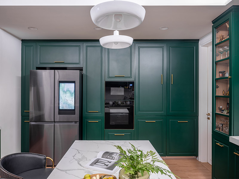
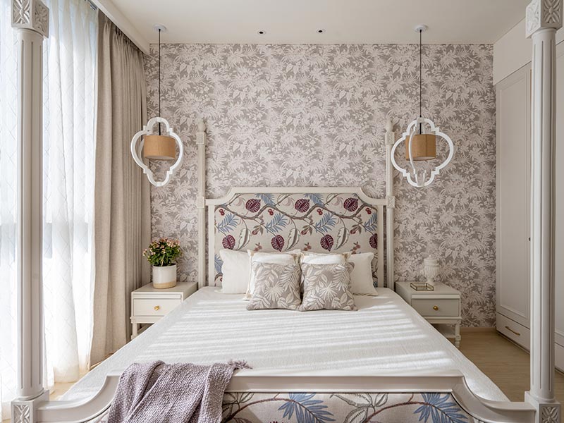
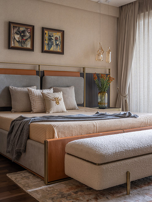
PM: We have not adhered strictly to one specific design style throughout. For instance, in the kitchen, we have taken a bold approach by incorporating a dark green colour scheme that makes a statement and adds a touch of personality to the space. Meanwhile, in the primary bedroom, we have opted for a more muted colour palette, utilising shades of brown and other earthy tones to create a warm and inviting atmosphere. This is evident in the use of dark leather shutters and wooden flooring, which add a natural and rustic feel to the space.
MM: How can we make homes with subdued colour schemes stand out?
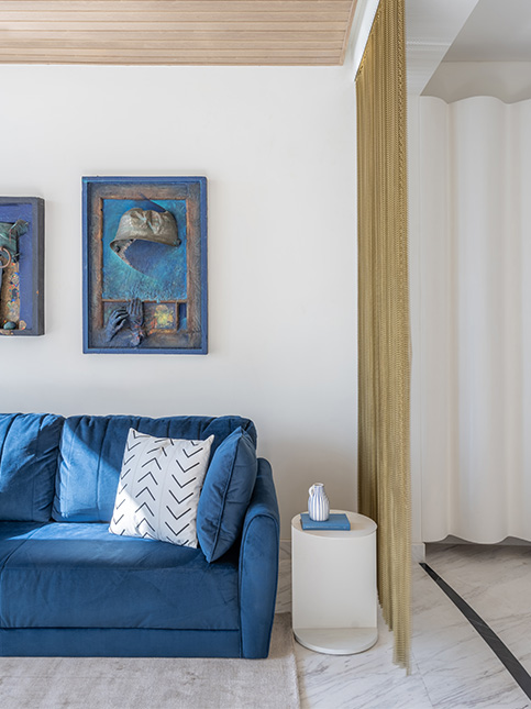
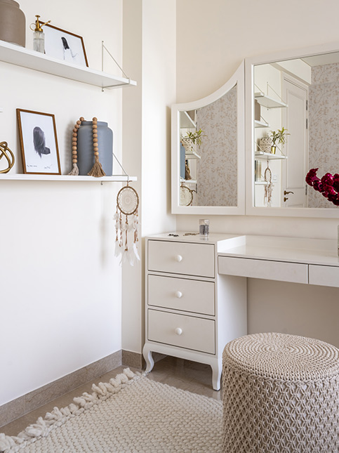
PM: We have added artwork and paintings with bold and bright hues that contrast with the neutral colour scheme. We have also used metal curtains that add texture and shine, thus creating a statement piece in the room. Patterns incorporated in the doors add visual interest and craft a sense of depth in the space. Additionally, we played with lighting, to create a unique ambiance.
