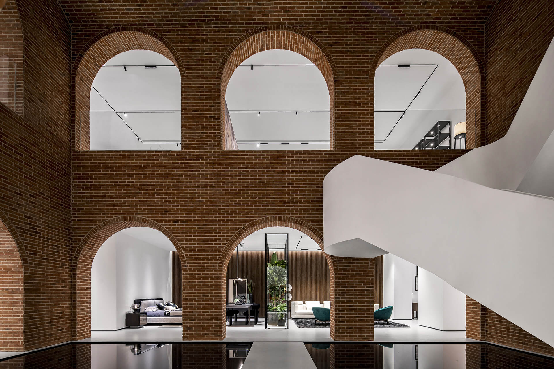
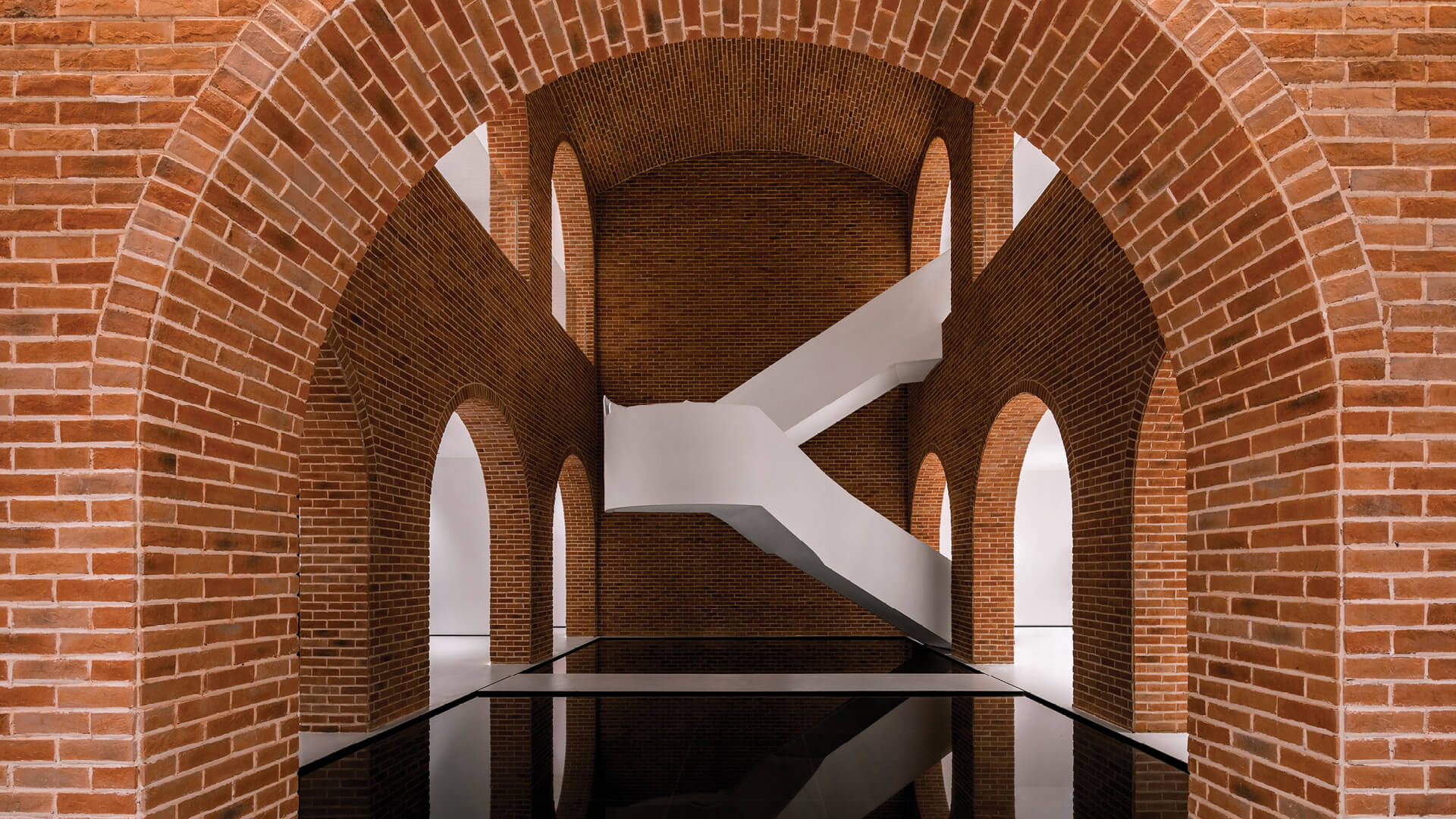
Recently, a collection of photos exhibiting a visually striking red brick building with a striking white staircase went viral on social media. Shortly after, another series of images of the same building, this time with a logo of the luxury Italian furniture brand Giorio Casa, and location of the Shenghui Furniture Mall in the city of Xuzhou, China were released. This resulted in a number of young people travelling from long distances to Xuzhou to visit the space. The building in the mysterious images is an exhibition and sales centre crafted for Giorio Casa by Wang Zhongli, the chief designer of design firm Catanian.
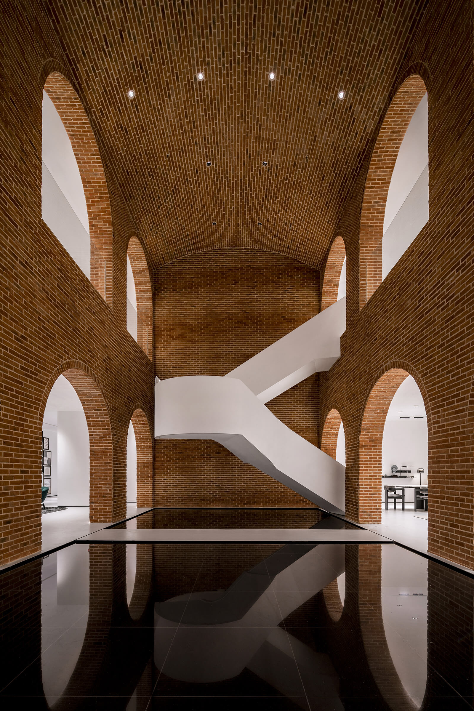
Giorio Casa was founded in Turin, Italy, in 1988. Zhongli, partner at design and architecture studio Catanian was commissioned to design the new Giorio Casa store with the aim of attracting people with a dramatic design concept. A month after its launch, the space was still inundated with people, proving that the designer’s concept was successful. The retail design of the store showcases Giorio Casa’s Italian roots with ancient Roman architectural elements. This new exhibition centre was intended to be a calming space with an atrium at its core. The architecture invites guests to have a one-of-a-kind spatial experience. The atrium of the store makes the space feel like a home and brings about a sense of serenity.

“The original intention of our design is to let people unload their emotions and feel calm in the space. This is a space inside the building and we want it to have an outside feel. So we implanted a vaulted space in the interior to become the core of the whole interior space. We flip the building and interior space to create an experience of contradiction and contrast,” says Wang Zhongli, Chief Designer and Partner at Catanian.
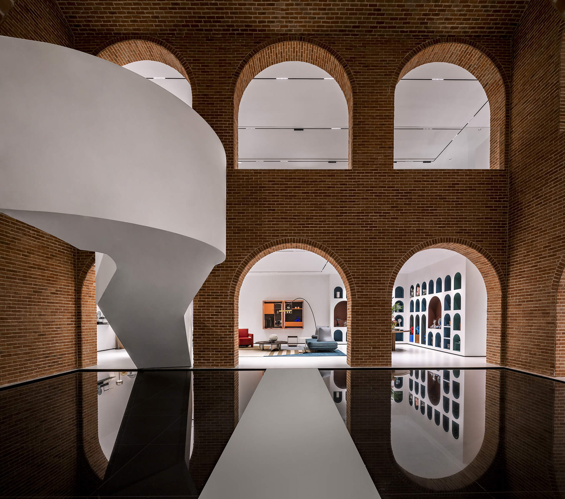
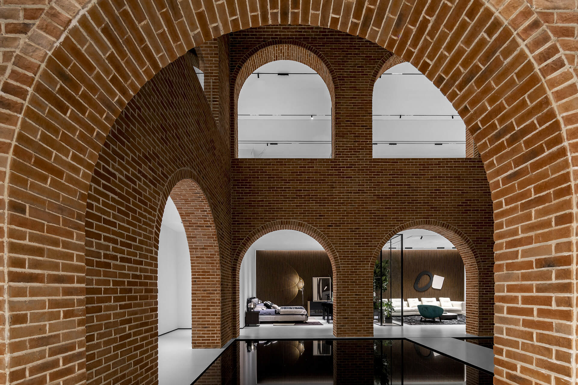
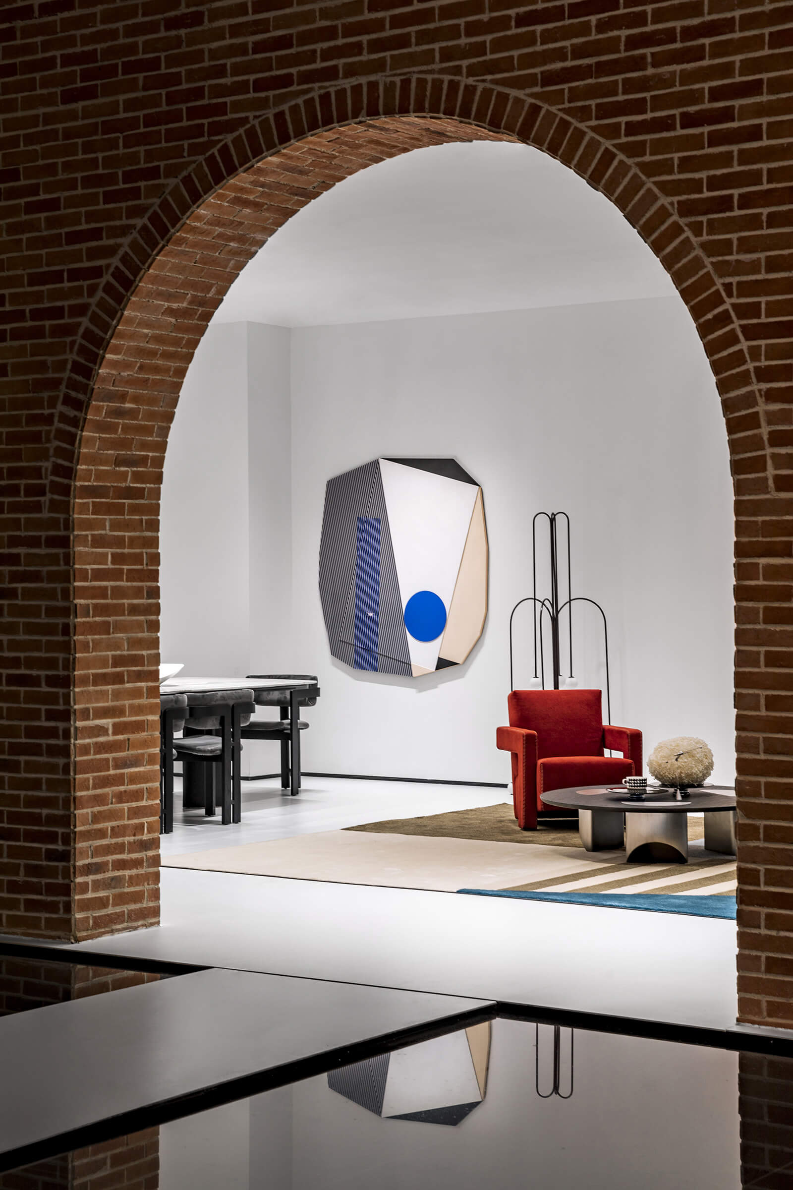
The Giorio Casa space is conceptualised to give an impression of a person’s luxurious mansion. The new two-storey space features an atrium in the centre, which is surrounded by interconnected rooms that exhibit the brand’s elegant furniture design. The atrium houses two square water bodies made of black fibreglass. The ponds offer a sense of tranquillity and make the space seem larger than it is. From the central atrium, a striking, spiral staircase and European-style, arched openings provide visitors access to all directions. The design of the atrium has been inspired by ancient squares prevalent in the cities of the Roman empire.
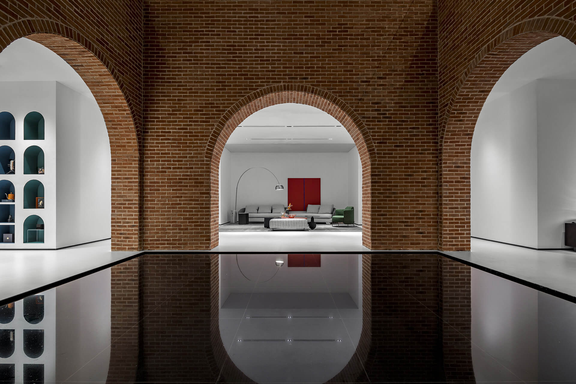
“Taking a glance at the Roman empire, you see pedestrians, carriages and horses passing through the Palatine Gate (main gate of the square) and gathering in the central square—this centripetal layout still has its power till this day. The space featured an atrium or square surrounded by several other buildings, which were interacting with each other, and integrated the functions of presentation, meditation, interaction and business activities in a vivid and charming manner—this inspired my initial design concepts,” adds Zhongli.
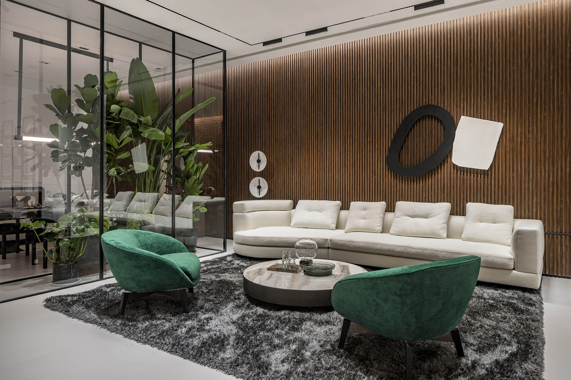
While the first floor of the space exhibits Giorio Casa’s products, the second floor is divided into an experience area, material selection area and a high-end customisation section. The design of the store evokes a sense of discovery and exploration within the visitors. As they walk between rooms it seems like they are touring a mansion. “Owing to our decision on the starting and ending point, the angle and design of the spiral staircase, as well as the way people move in the space, visitors can either take a tour according to the map or wander randomly. They can return to the atrium at any time, as it serves as both the starting point and the ending point of the tour, and can be accessible from all directions, just as a transportation hub. Thus, the atrium becomes a functional artwork in a definite form, creating ever changing experiences, emotions, wisdom and energy, and delivering harmony between people and the environment,” mentions the designer.
For the layout of this new store, the designer moved away from the layout of conventional stores to craft something unique and timeless. With this unique space, Zhongli wanted to bring the outdoors inside, and bring about a sense of peacefulness. Moreover, by changing the way people feel in a space, he hoped to alter their shopping habits as well.
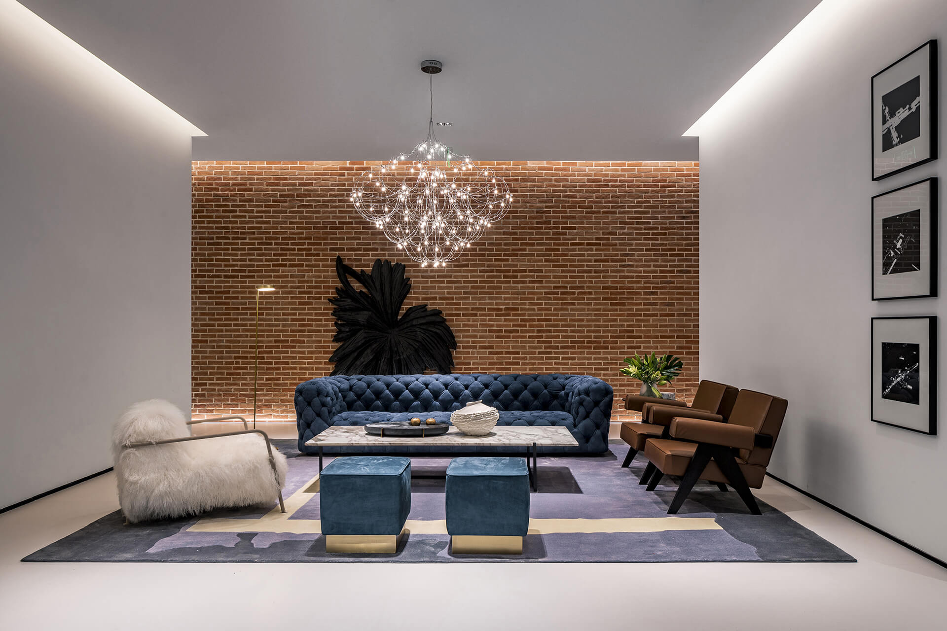
“Based on Chinese culture and the traditional Italian architectural styles, we built the atrium with bricks in an indoor space, presenting openness and inclusiveness at the same time. In doing so, the space accomplishes its business purpose by naturally evoking people’s desire for consumption in a smart way. As scenes presented behind the arches vary, people picture different stories in their minds, which testifies to the power of the space. With peace of mind offered in the atrium, visitors will be attracted by the scenes behind the arches. As they walk into and out of different scenes, they will have viewed the products, and most of the selling job is already done in the process,” says Wang Zhongli.
Moreover, as a response to the new interiors, bespoke uniforms for the Gallery’s staff have been designed by French fashion designer, Sonia Taouhid. The new uniforms are charming dresses bearing Taouhid’s signature frills, akin to Calla Lilies, in violet streaked with golden yarn in a nod to the golden surroundings. To complete the new transformation, Sketch will soon debut new ceramic tableware designed by Shonibare and manufactured by British brand Caverswall to serve its delectable afternoon tea and dinner in. This brave new redesign by the Gallery at Sketch leads the way for other well established restaurants and art venues to shake things up in the post lockdown world.
