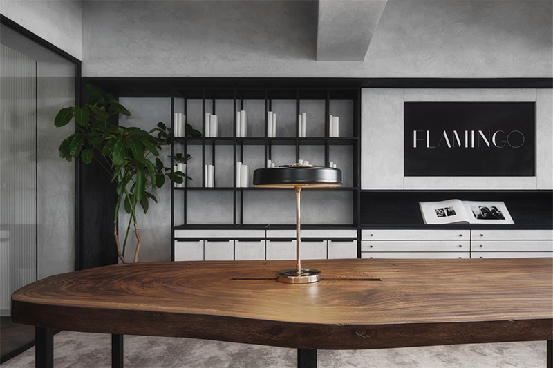
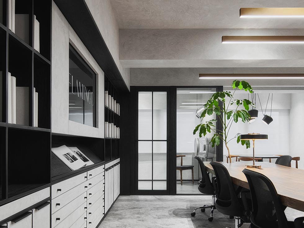
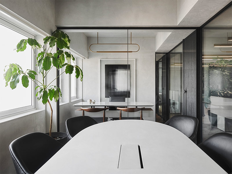
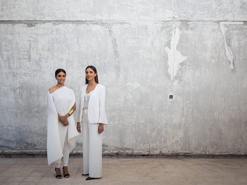
Established in 2011 by Esha Pandya Choksi and Aashni Kumar, Studio Flamingo is a Mumbai-based design firm, which strives to craft beautiful and balanced spaces that reflect a blend of functionality, aesthetics and innovative technology. The firm undertakes residential and commercial projects in areas of interior design and architecture across the country. Their Mumbai office, which is approximately 3,000 square feet, was entirely gutted to its bones and rebuilt on the basis of their functional requirements and vision. With its minimalist style and distinctive design elements, this avant-garde office feels like an extension of a stylish home. It has been conceptualised not as a typical office. The founders of Studio Flamingo take us on a tour of their Mumbai office.
Media Milestone (MM): What is your design philosophy?
Esha Pandya Choksi and Aashni Kumar (EPC and AK): Our signature style is delivering design solutions of high function and aesthetic value, while creating an unmistakable natural rhythm in the space. We achieve this by paying close attention to how we plan and organise our design, by incorporating and carefully working out design details that are beautiful but minimalistic, and by incorporating the technique of repeating a set of closely curated materials throughout the space. This harmony is our signature style, which is showcased in the design of our work space as well.
MM: Which part of the space did you enjoy designing the most?
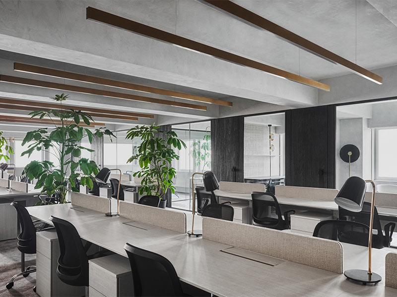
EPC and AK: The part of the space that we enjoyed designing the most is the open office area, which is inhabited by a majority of our team members. Our intention was fuelled by a single thought, i.e., most working adults spend more than 50% of their waking state in an office, and due to this, the office has always taken on the role of a ‘second home.’ The foremost step undertaken to achieve our design objective was to chart out a layout that not only met all requirements but carefully rationed the space between open and collaborative work zones and closed or private work zones. This distribution was done such that more than 90% of the area in the office receives natural sunlight.
MM: How does the ideology of Studio Flamingo tie in with the design of the space?
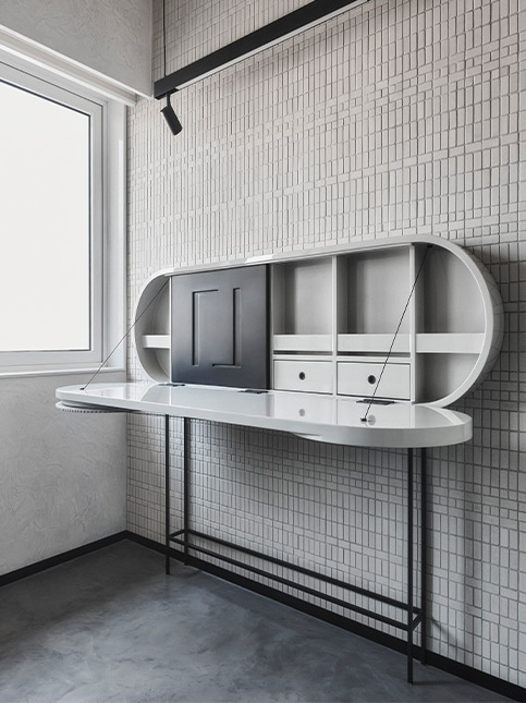
EPC and AK: As we embarked on what is possibly our most personal design journey, we thoroughly fleshed out our design intent. While functionality never leaves the prime spot in any of our designs, we knew that this space had to be more than one that showcased our artistic sensibilities while staying in step with utilitarian goals. This space had to engage in a quiet rebellion to debunk a stereotype.
MM: The space has a black and white colour scheme. Why did you choose it?
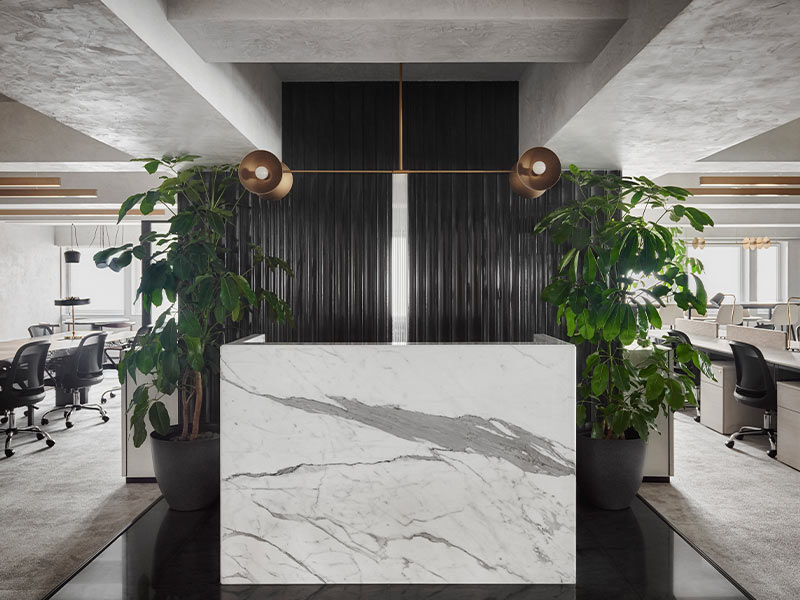
EPC and AK: We chose a black and white colour scheme purely because we believed that a monochromatic colour scheme supported by softs greys, wood and gold would add a certain stark backdrop to the open workstation areas that consume most of the floor plan. This helps the eye focus and take in and appreciate larger visual compositions.
MM: What’s the material palette of the office?
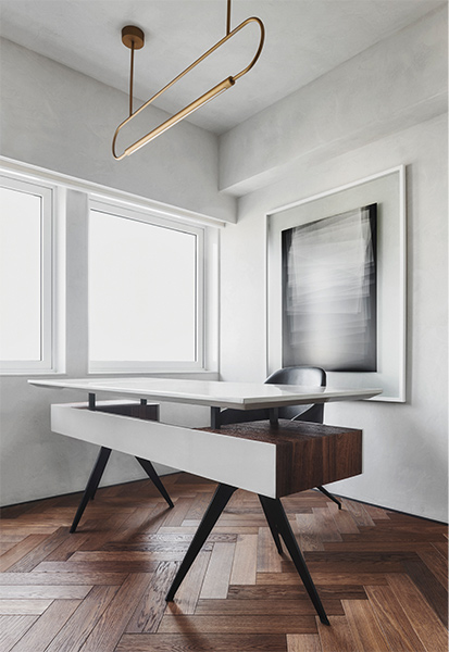
EPC and AK: We made a deliberate attempt to juxtapose rustic and unfinished treatments with polished and finished treatments. What you get to see is a visual treat of well finished pieces of furniture and decorative lights juxtaposed against unfinished walls and flooring. The main ingredients in the cocktail of materials include: Marble and micro concrete on the floors, supported by texture paint on the walls.
MM: Do you have any advice for people who would like to achieve a similar aesthetic in their offices?
EPC and AK: For people looking to achieve a similar aesthetic in the office, our advice would be to first understand the nature of work being conducted in the space. For example, assess the balance between open and closed spaces, deep work requirements versus the requirement to collaborate, etc. This assessment and understanding will prove to be a guiding light to achieve the most functional and efficient layout. After having done that, one should adopt a design aesthetic that adopts design decisions and details that lead the employee to feel closer to nature. This is because, regardless of the nature of the business, creating a connection with nature will ensure an environment, which will prove to be a positive mood influencer for its users.
