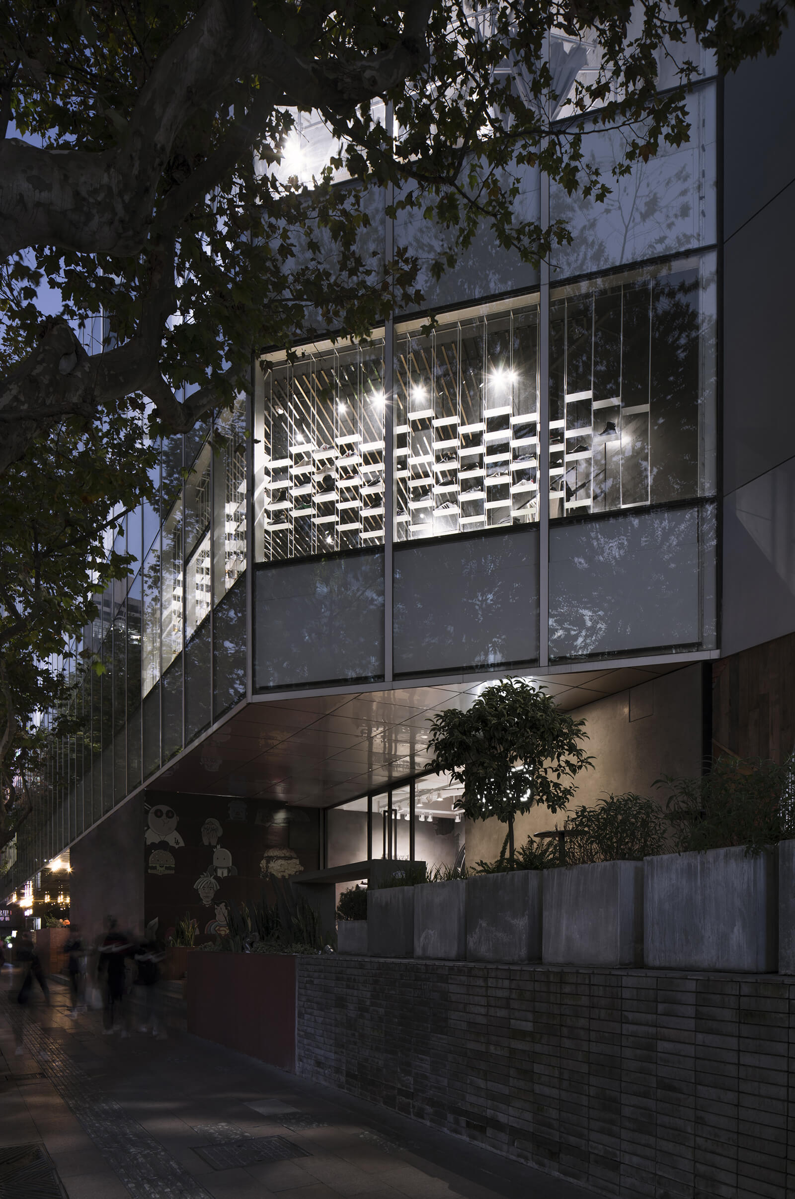
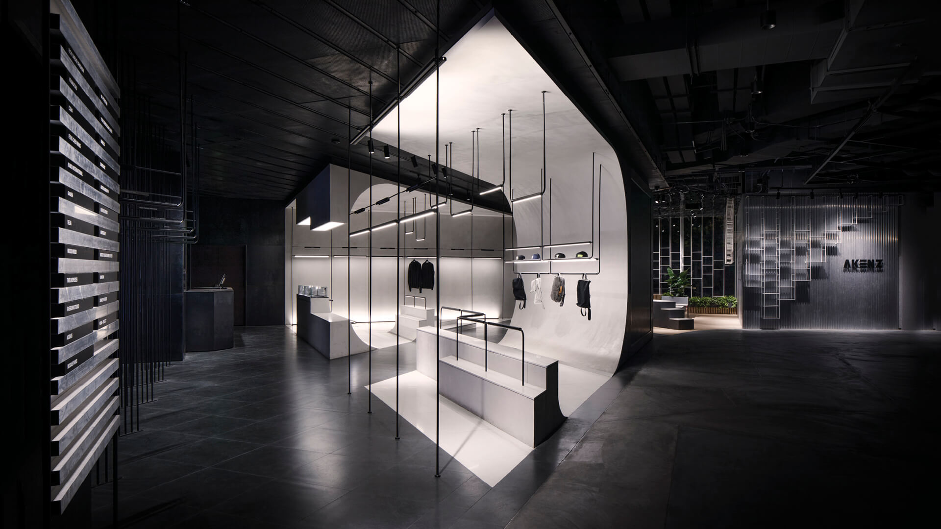
Lukstudio, a studio from Shanghai, China, has designed a streetwear store evocative of the one-of-a-kind shapes found in a skatepark. The shop is Akenz, a Scandinavian luxury streetwear platform’s flagship store in Shanghai. As streetwear is an offshoot of socio-cultural movements such as hip hop and skateboarding, the firm believed that a design reminiscent of a skatepark would be a perfect fit. Known as ‘The Skatepark’, the flagship store is located on the second floor of TX Mall, a new retail destination on Huai Hai Road. Keeping in mind the triangular shape of the store and its unusually large windows, the shop has been divided into two separate sections, showcasing ‘indoor’ and ‘outdoor’ spatial qualities.
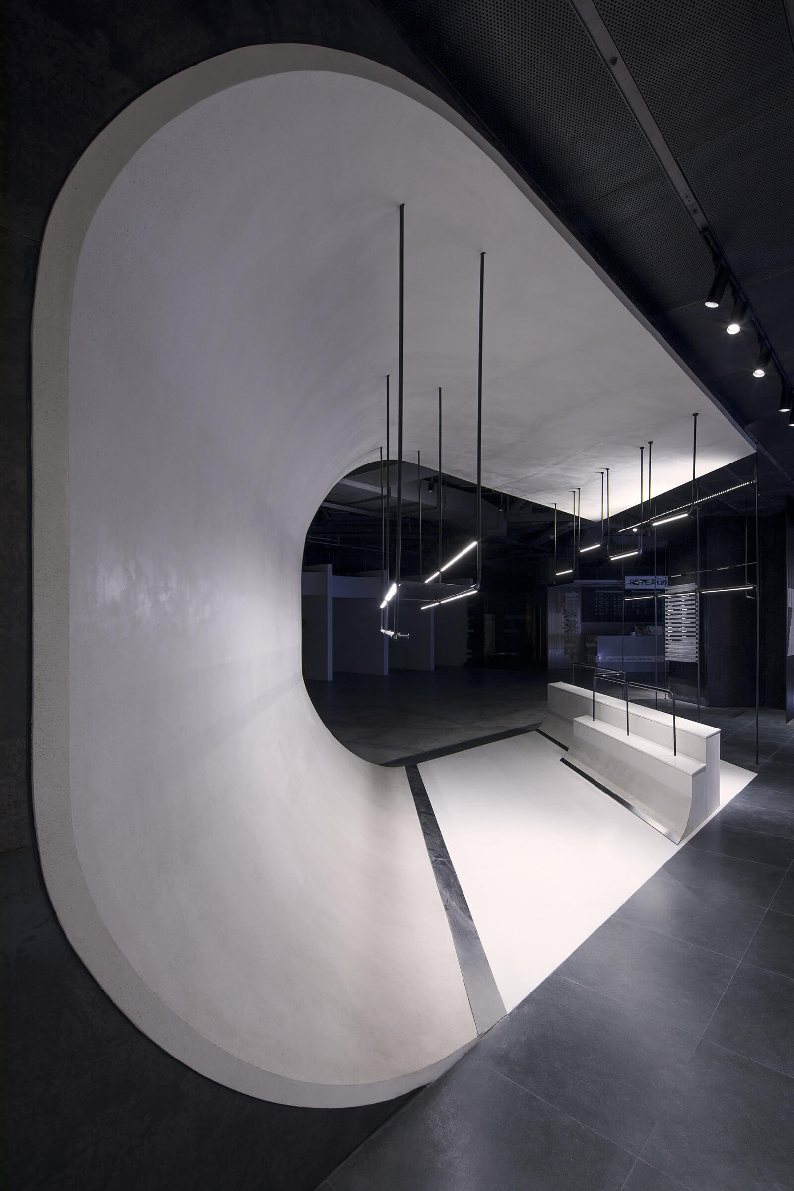
The design of ‘The Skatepark’ store provides guests a unique immersive experience. The interiors of this avant-garde store enhance the brand awareness and elevate the overall shopping experience. At this shop, the main values of the streetwear culture are interpreted into recognisable elements found in extreme sports and city streets. Moreover, while the store is visually striking, it’s also practical. “On top of maximising retail surfaces at an irregular site, the design layout had to accommodate a fire-exit corridor for the general public in the mall. Moreover, the fact that it’s on an upper level also posed some challenges in terms of attracting street passengers,” says Christina Luk, Founder of Lukstudio.
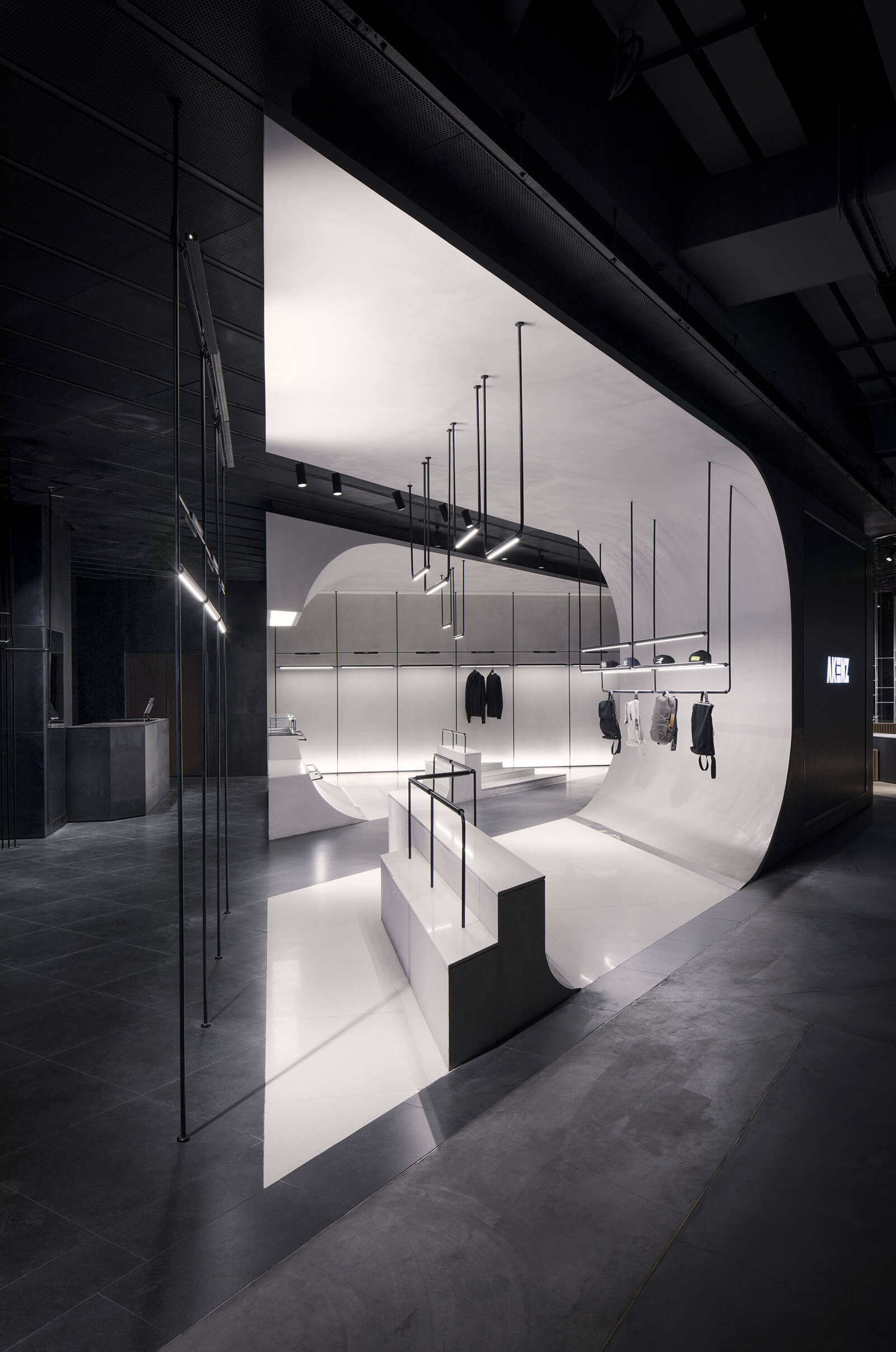
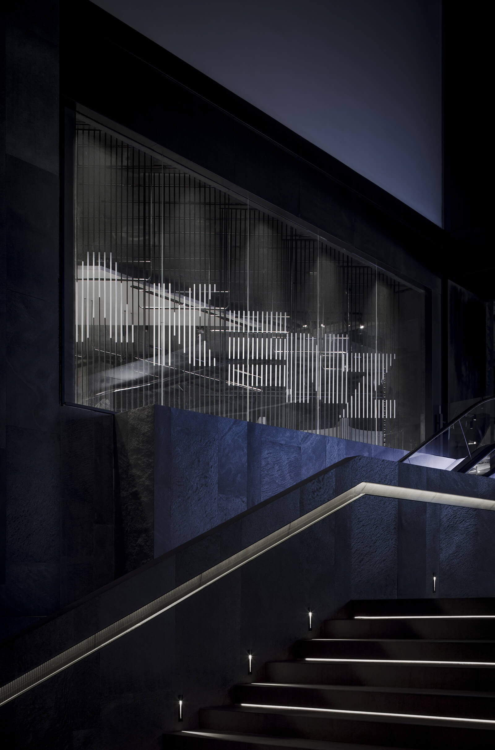
As guests enter the mall and climb up the second floor, the first sighting of the store is its logo that has been painted on five sets of black pole dividers at the display window. A white reflective strip has been painted on each pole. Together these white strips create the characters of the logo. Walking past the window, visitors arrive at the ‘indoor’ skatepark. They are welcomed two white, floor-to-ceiling ramps that stand out and shine a spotlight on the products displayed within. The white ramps contrast with the dark industrial background of perforated panels and black tiles.
For the shapes of the fixtures, the Lukstudio team took inspiration from the metal grind rails in skateparks. They translated the rails’ sturdy design into a light-weight modular system. These modular pole and rail forms integrate LED lighting and double up as support shelves. An upper rail with plug-in tags enables easy changes of the displays. While the large ramps are evocative of a skatepark, these minimal structures are reminiscent of the flexibility and spontaneity of the skaters.
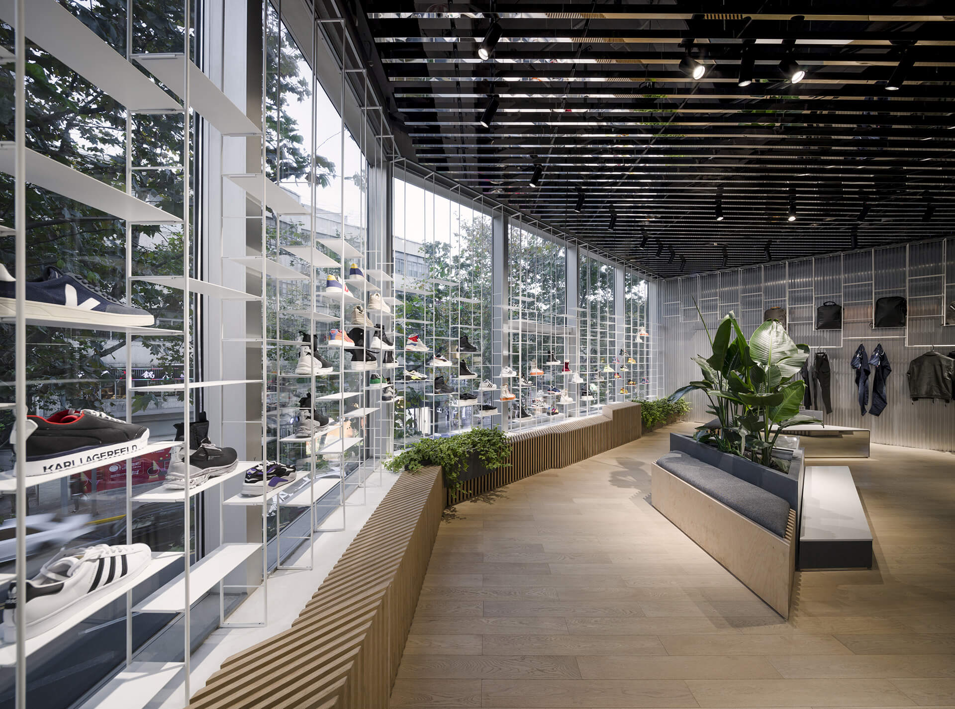
A walkway between the two ramps opens into the daylight-filled ‘outdoor’ park, where triangular display platforms are placed, just like street furniture. Here, the lush green trees and lively street below are reflected by mirror strips on the ceiling. Evocative of rays of light, the mirrors interact with the visitors’ movement in space and reflect fragmented hues, creating a visual spectacle. Alongside the window, a continuous platform made of plywood blends plants and seating, just like a public bench. Furthermore, a light-weight modular rack runs through the entire 16.5 metre glazed facade and showcases a large collection of 210 shoes.
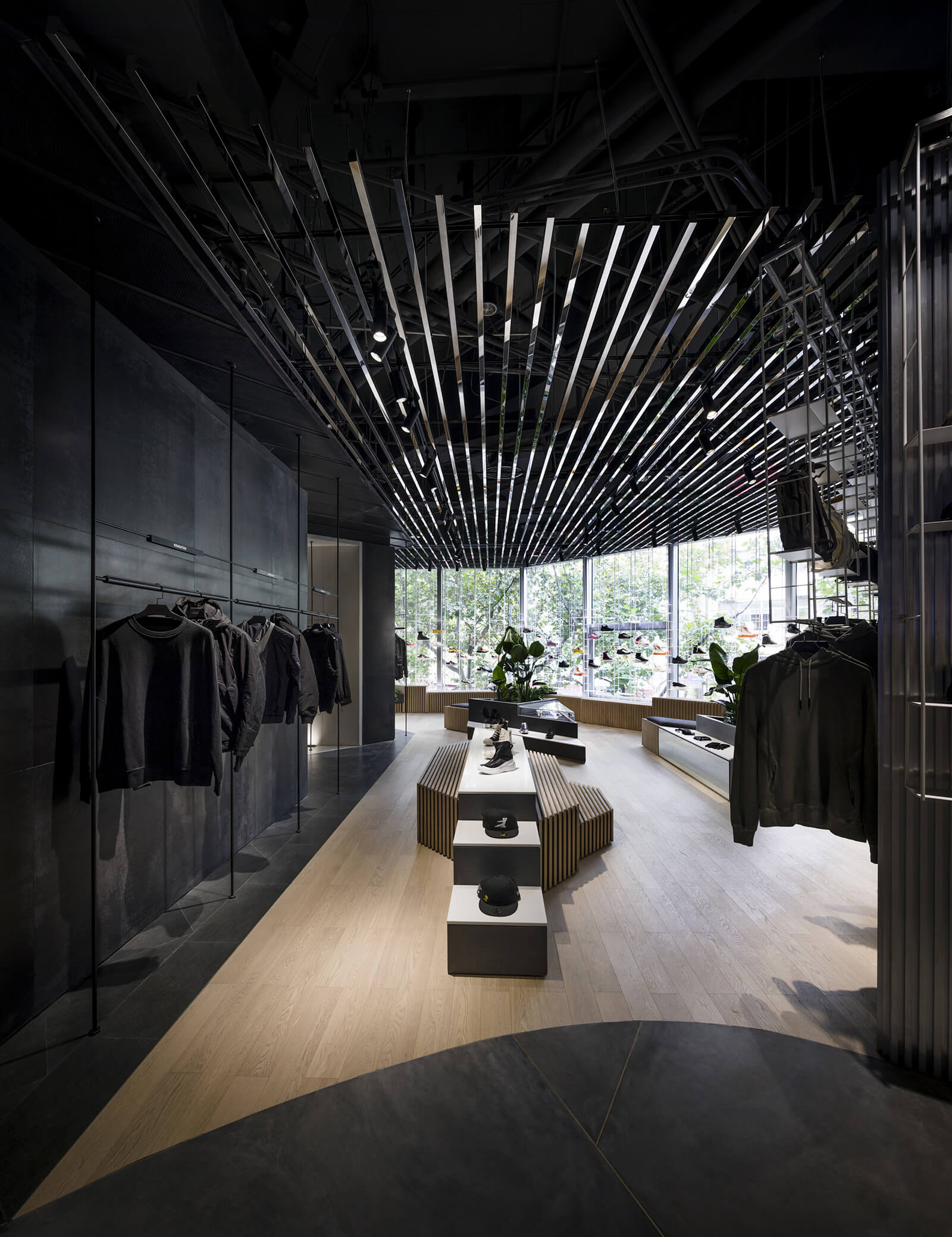
“The big ramps and the grind rails are the key formal elements of a real skate park that we integrated into the retail space. For materiality, we selected an industrial palette such as iron panels, powder-coated stainless steel and plywood panels that are often found in a skatepark. I am particularly excited about the mirror stainless steel strips in the ceiling at the ‘outdoor’ park. I love how the reflective feature interacts with one’s motion in space and abstracts surrounding canopies and streetscape into fragmented colours. Depending on the time, the day, the year and the viewer’s position, these mirror strips add a completely different dynamic to the store,” concludes Christina.
